We are excited to launch a refreshed brand identity and a new website giving Family Works Northern a more modern and contemporary look.
The brand update includes a new logo, colour scheme, and graphical elements.
Our journey toward this new identity began with extensive research and seeking feedback from a range of stakeholders.
Collaborating with a brand agency, we aimed to create a brand that feels more modern and unified and better reflects our commitment to tangata whenua.
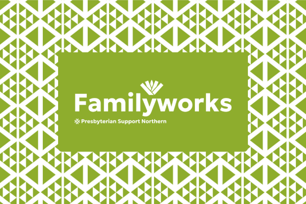
A key component of the new Family Works logo is the harekeke (flax plant). This symbol represents the whānau unit with the child in the centre next to parents and grandparents – tamariki, matua and tipuna.
Family Works also has a new pātikitiki pattern. It represents the flounder, which in Te Ao Māori symbolises manaakitanga and abundance.
Our sister brands under the Presbyterian Support Northern brand have also been refreshed with a new look and feel, which you can view at the bottom of our website.
Stay tuned as we roll out these changes across our digital channels, brochures and other printed collateral.